Thursday, September 29, 2011

The Master Bedroom

On to the next room in my house, the master bedroom.  It has taken me forever to have a real "grown up" bedroom, like ten years.  I always put off fixing up our bedroom because I'm more focused on the rooms that people will see when they come to your house.  There are still some things that need to be done in the room, but here it is in its current state.


Check out the upholstered headboard I made for the room.  The tutorial can be found here.  I love it and it was pretty easy!

The duvet I made with my mom and the curtains I finished up later on my own. The nightstands are old typing tables that I stained an aqua color years ago.  The ceiling fan was replaced when we moved in because I was terribly afraid it was going to come crashing down in the middle of the night.  A ceiling fan is a complete necessity for me here in Texas.


This picture really makes me want to change out the old doors. 

Wednesday, September 28, 2011

Mickey

Here's the latest painting I finished with Mickey and the gang.  I hope the birthday girl I made this for likes it.  Now I need to get started on the next painting since it needs to be done in the next two weeks.


Monday, September 26, 2011

Girl's room


Today I'm posting pictures of my daughter's room.  When we first bought the house the room was just white, but of course she is very girly and chose pink for her walls.  We added crown molding and new blinds.  The furniture was my sister's bedroom furniture that I gave a fresh coat of paint.  I'm hoping at some point we can replace the doors.  She loves her room and is very happy with her room.

Here she is sitting on her Hello Kitty floor cushion that my sweet friend, Kate made for her.  You can go check out her fantastic blog over at Between the Toys.


In this picture you can see the cute fairy quilt my mom made. Above her bed is the canopy I made.  You can find the tutorial for the canopy here on my blog.


That's it folks! 

Friday, September 23, 2011

Morning Glory


The Morning Glory is a pretty cool organic lamp.  It is made by Aqua Creations.  They have some pretty funky, organic furniture. To see their collection, click here.

Sunday, September 18, 2011

From Wet Bar to Half Bath


We've been slowly working on parts of our house and sometimes it is hard to see the progress until you start looking at before and after pictures. Today I'll be showing you my half bath that was previously an awesome 1970's wet bar.  For us the wet bar stored random bits of junk and a margarita machine. Our half bath was previously located adjacent to the breakfast area in our kitchen.  When we were looking at buying our house that was one of the very first things I wanted to change.  I think my husband thought I was kidding.  Here are the before pictures.  We took them right before demo.


Here is the picture that shows you the pass through that was in my living room.  

The formica that was used in there must have been popular because I know at least 2 houses on my block with this same counter tops.  There was also some wallpaper that had been painted over and once we removed the shelves we found some pretty interesting wall paper.  It's always fun to see what was previously there and what past homeowners have done.  Unfortunately, for anyone else there is no longer a wet bar in existence in this house. With lots of work it has turned into a half bath.  I'm not going to lie this was an enormous undertaking to take on as a DIY project.  I mean if this gives you any idea, the sewer line had to be rerouted so we could accommodate another bathroom.  All the work was done by us with help from my family.  Here are the after pictures.


The artwork in my bathroom are framed perfume labels. 


Friday, September 16, 2011

Velvet


It's been a while since I've posted something for "Fabulous Furniture Friday".  I've had lamps on my mind lately since I've been tasked with making some sort of lamp with my daughter's class.  Whew, this is a difficult one.  I think I've figured it out, but that will be a different post.  On to this cool light I've found.  What makes it unique is the beautiful lampshade.  It's called Velvet, but it is actually made from cut leather and felt.  I just love the way it looks.  The company that makes this light is called &'Costa.  You can check out more of their collection here.

Tuesday, September 13, 2011

Living Room Revamp

Today I thought I'd show you the living room of our house.  This room has been a work in progress and really the only thing it is lacking is a mantel and a new rug. First I'll show you the before pictures.


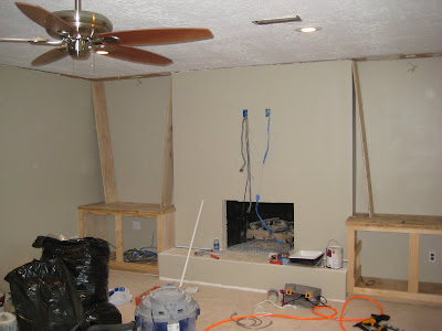
You might not be able to tell from the pictures, but it had wood paneling that was painted.  The reason we literally took this room down to the studs was because we were getting rid of our awesome 1970's wet bar and turning it into a half bath.  I say "we", but it was really my husband, brother and dad.


The picture above shows the walled up pass-through from the wetbar. This meant we would have to get rid of the paneling. It was very sad.  Can you tell I was disappointed?  The fantastic part about taking this room down to the studs was that we were able to add more wiring for electrical and lighting.  We had such little light in our living room that it was pathetic! Then of course it worked out nicely to mount our TV above the mantel since we framed out the fireplace.  The brick on the fireplace wasn't anything special.  It was painted white and we found out that it wasn't any prettier underneath the paint.  So, I opted to have it framed out and sheetrocked.  That way the upper cabinets could be recessed in the wall.  Here's the before picture.


In Progress


After Picture

As you can see from the picture we added granite for the hearth and fireplace surround.  It really is silly that we even have a fireplace since we live in Houston and it rarely gets cold enough to use a fireplace. The granite installation was the only task we hired out. Everything else was a DIY project done by either us or with the help of our family members. Thank you to my family for all their help!
This was an enormous project to take on ourselves, but it was a great learning experience.  Here's a list of everything that was done.
1. Take down paneling
2. Add more recessed lighting & electrical.
3. Center the fan in the middle of the room.
4. Frame out the fireplace.
5. Sheetrock the walls.
6. Texture the walls.
7. Build new cabinetry.
8. Add molding and trim (crown, base, door frames).
9. Replace closet door.
10. Paint walls, trim and cabinets.
11. Granite installed by a subcontractor.
12. Rip out the carpet.
13. Install engineered wood floors.

Now to show you more of the after pictures.


Sunday, September 11, 2011

Calendar & Bulletin Board


Since school started it has been difficult to stay organized.  I keep multiple calendars, one on my computer, one on my phone and then I always end up with one on paper.  It's ridiculous, but I really need to see it in front of me for me to remember what is going on. I figured it was time to get a dry erase calendar, but I also needed a bulletin board to pin up all the additional pieces of paper, invitations, etc.  Of course I didn't find anything I liked at the store and it needed to fit in a specific spot of my house.  I wanted it to hang in my kitchen, but I wanted it out of the way.  It hangs on the side of my kitchen cabinets.  This is the perfect spot for me since it allows for me to check it while I'm on my way out the door.
I have to give the credit to my husband for building this for me. I came up with the design and he figured out how to make it.  I found the magnetic/dry erase calendar at Target and the bulletin board was cut to fit.  The frame uses casing for door frames on the sides and then the top and bottom are composed of different types of molding.  Once he was finished assembling it was my turn to paint it.  I love how it turned out!
I'm hoping this will help me stay more organized this school year.

Wednesday, September 7, 2011

New Paint Job

As the younger brother, my son inherits some toys that are girly and PINK from his older sister.  Recently, he started to ride this little hot rod.

Hahaha.  I decided it was time to give this little 4-wheeler a paint job.  I found a great product from Krylon that you can use on plastic and there is no prep involved.  All I did was tape off the areas that I wanted to keep and went to town spraying the 4-wheeler with cherry red paint.


I was afraid it wouldn't work, but it looks awesome!  My little guy loves his new bike.  He had to try it out before bedtime.


Off he goes!

Monday, September 5, 2011

Frosted Glass Fix

So, as you remember from a previous post I have some Ikea bedroom furniture that I love, but there is one little problem, you can still see everything that is in there.  The idea of frosted glass is great, but it's not so appealing when you have all sorts of different colored clothes and it starts to look messy.  I had already done this on the drawers to my dressers in a previous post and decided that the armoire needed the same thing.  Here's a picture of what it looked like before.

The only problem with it was the long length of glass.  I thought I could get away with using some sort of silver wrapping paper.  That didn't work out so well.  It looked terrible and it didn't lay flat enough and you could see every little wrinkle.  So I went back to the posterboard.  Thankfully, I could break it up by the faux muntins.  Are you wondering what a muntin is? Good, me too.  It's the strip of wood separating and holding the pains of glass in a window.  Well, mine is faux since the strip is just stuck on to the glass to look like a muntin.
This project took me 8 pieces of silver posterboard, but the end result makes me wonder why it took me till now to do this.  I've had this armoire for six years and it has always bugged me that I could see the items through the frosted glass.


The inside isn't as fabulous, but you can see how I put the posterboard inside. I'm just happy to have another project complete and off my list.